Ship emissions and air pollution in Denmark
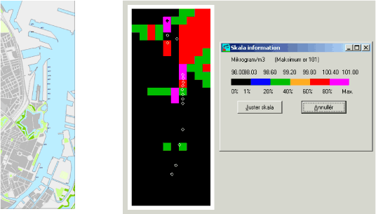
Figure 5.6 The left panel shows a map, while the right shows a corresponding schematic "map" of concentrations. The two maps cover the same area (1800 m x 4800 m). Each of the small squares on the right is 200 x 200 m.The white rings on the schematic map represent quays.
For each calculation point (receptor) the schematic map shows the nineteenth highest hourly concentration of NO2 during one year, according to the Basic Run.
The values displayed should be compared to the limit value of 200 μg/m³. Please note that the scale is limited to the interval 98 to 101 μg/m³. Throughout the black area there is a constant value of 98 μg/m³, and this value remains 98, irrespective of whether the cruise ships are present or not.
Version 1.0 October 2009, © Danish Environmental Protection Agency